Socials:
Twitter - Telegram - Youtube - LinkedIn - Instagram - Newsletter - TikTok
Introduction
Good morning everyone
Today we are here to talk once again about onchain analytics.
For today's article I have chosen four charts that are aimed at analyzing bear markets and bull markets, charts that I have personally developed based on experience and the most used market metrics and indicators, with the determination that it is simpler it is also more accurate when it comes to analyzing large price movements to stabilize the tops or bottoms of the macrotrend.
You can get my view on the argument in video format on my live stream on:
Today we’re gonna talk about:
200 Ratio
200MU
Relative Strenght Mean
Abyss Bubble Momentum
But let's not waste any more time and immediately get into the merits of onchain analysis
200 Ratio
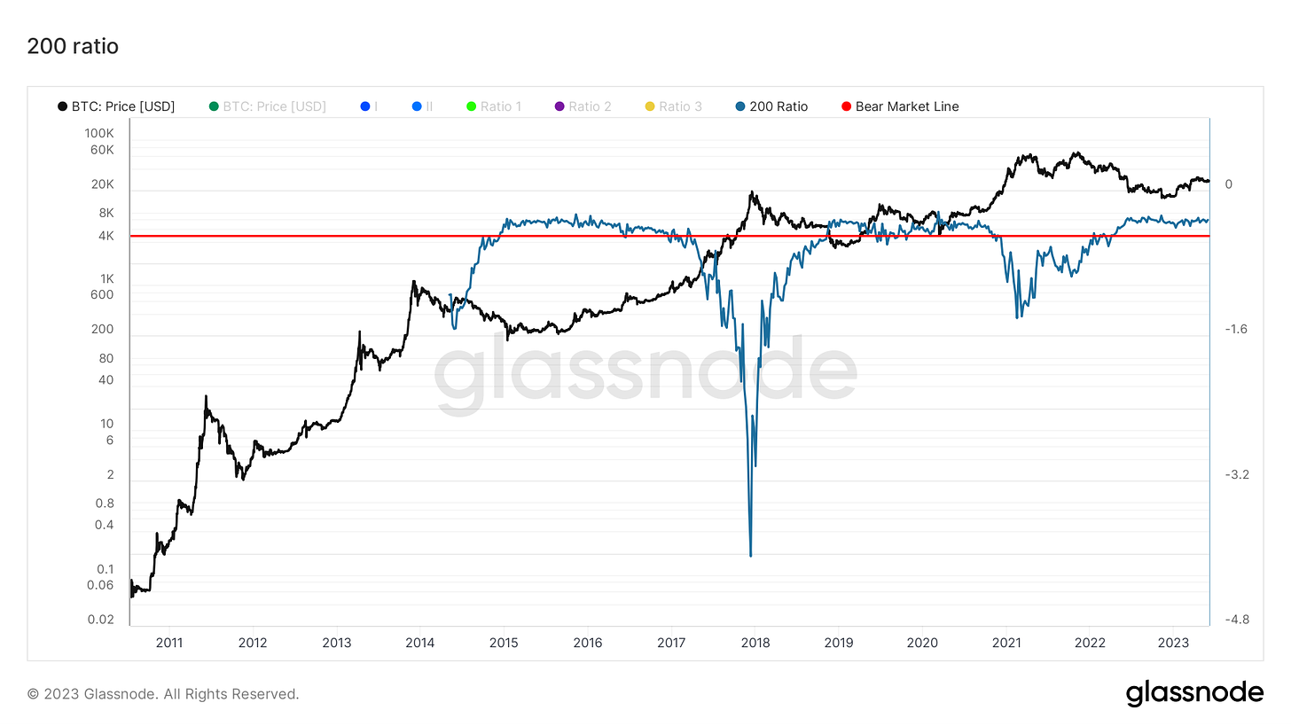
The 200 Ratio is a metric I developed to have certainty regarding the bear market.
This metric was developed to be pinpoint accurate at the price of lagging the market
In fact, when the price is undervalued from the point of view of its relationship with the 200 and with those of the 200 with each other, the reason is always and only that the price action has been tending downwards for a long time and/or that the price falls much more in a hurry of the aforementioned reports
When that happens it's time to buy hard and market, in DCA, as you like, but there's no better time before the next bull cycle
In this case, this very slow and lagging indicator still reflects our situation in the eyes of most market participants, i.e. a protracted bear market that continues to play out throughout the year.
When this metric is off the red line and then below, we could well see price action similar to a bull market.
For now we still have to wait, as I have said many times since, but in a few months, what I say will be on everyone's eyes
200MU
The 200MU, whose name was born as a joke, since it should have been 200MM to better reflect the name, takes the 200 on the price differently, as a percentage, and graphs it to find moments of overvaluation or of undervaluation of the price, which then corresponds to a top or a bottom of the market in the macro cycle
This metric, like the next three, even if slow, tends to identify possible tops or bottoms before they form, giving an early warning signal able to make us understand that something is changing under the surface and to start paying more attention
In this case, in fact, of the 3 metrics below, this is the one that best reflects the change I noticed in recent weeks, as my previous analyzes can confirm
Here we returned to rise after touching the bottom and we exited the area of average price undervaluation, taking us to a higher level, a symptom of a recovery signal from the markets that bring us back to a promiscuous level for the price.
Thanks to these 4 metrics combined however, our hedge against the market is palpable
It will still be a while before returning to the red zone, but having left the green one is only the first important and necessary step to take
Relative Strenght Mean
This metric takes into account the daily and weekly RSIs and relates them to the price to determine if the relative strength of the trend has reached a maximum or a minimum and if the macro trend is increasing or decreasing
Also, being a slow metric, but still more agile than the others, it points out that the current trend is tending upwards and that the strength of the trend in recent weeks has remained in the same area, with the last peak lower than the first of the last two, still not sufficient in my opinion to determine a real downward trend by force
Here too we find ourselves recovering after hitting the bottom.
If taken in confluence with the metrics we are talking about today, this indicator too can show us a macro bottom in advance and give us more clues about a local top, with possible descent from a local top and vice versa
For me it still remains a perfect indicator that indicates how to move ahead of the market so as not to remain outside or trapped inside it
Abyss Bubble Momentum
The abyss bubble momentum is exactly what it says it is, a slow indicator, but which manages to anticipate a cyclical macro bottom or top by very little and which gives us an idea of the momentum and therefore of the speed of the downward or upward trend
The latter takes into consideration the 200 of the weekly adjusted for the market price, so as to be able to give us an idea of the speed and directionality of the trend
Historically, when this metric returns above the green line, and around -50, therefore halfway between the green and red lines, the chances of a return to the bear market are exclusive to a black swan, therefore equal to the chances that it will occur
For now this metric, given the aggressive directionality, and the ratios it shows in the graph, is still in the bear market phase
Overall we're at 2 out of 4, so half of today's metrics signaling us a trend reversal, while the rest are still in bearish territory.
As all 4 used to be, this to me is a sign that once again, while most are not looking closely, something is changing.
The seed of the bull market is here, but it will take months to germinate. Stay with us to find out when it's time for an effective bull market to be in full view and when it's time to sell other people's greed before it all collapses, or at least we will try.
Good day!
Author
Joele Novelli
Socials:
Twitter - Telegram - Youtube - LinkedIn - Instagram - Newsletter - TikTok
(All opinions expressed above are the author's personal opinions and should not form a basis for making any investment decisions, nor should they be construed as a recommendation or advice for engaging in any investment transaction.)


