Social Links
Joele Novelli
Twitter: https://twitter.com/ChainLogAnalyst
Telegram: https://t.me/ChainLogAlphaGroup
Youtube: https://www.youtube.com/@chainlog9504
LinkedIn: https://www.linkedin.com/in/joele-novelli-531101248/
Instagram: https://www.instagram.com/chainlog_ig/
Newsletter:
Hi everyone
Today we are here to talk once again about onchain analytics.
For today's article I have chosen 6 charts that are specifically aimed at analyzing the profitability of market participants looking for any danger signs after the movements deriving from last week's awakened wallets and some considerations regarding the long-term price action and where we are currently in the macro cycle and why, by studying the data from another pair of charts.
So today we will talk about:
2 Realized Profit Distribution (Age and address specific)
2 Realized Loss Distribution (Age and address specific)
Long Term Holder Realized Loss (% of LTH MCap)
Whale SOPR
But let's not waste any more time and immediately get into the merits of onchain analysis
2 Realized Profit Distribution (Age and address specific)
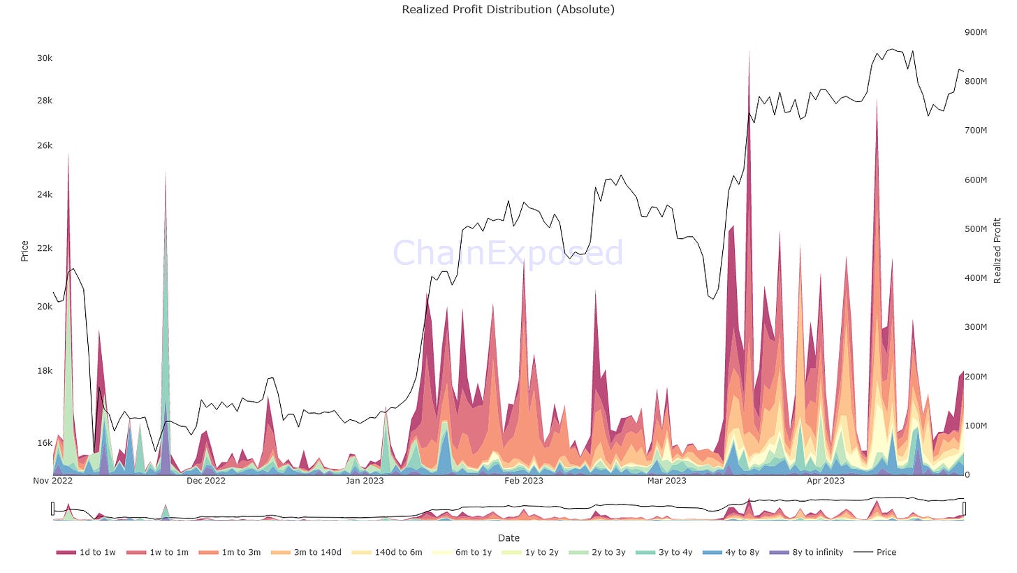
The realized profit distribution is an onchain metric that allows us to identify the basic onchain cost (the value of the asset) for each category of specified holders, in this case by age and amount of Bitcoins held, and therefore to distinguish the latest movements to understand which of these moved their Bitcoins while the market price was higher than when they had previously moved them.
Simply put, it's about understanding who has made profit onchain.
Above we have the realized profit regarding the age of detention.
As you can see, in the last period, most of the profits made onchain derive from short-term holders, warm colors, despite the last "awakenings" of wallets dating back to the time of Satoshi or so.
Here therefore we can be sure that these movements have not impacted the price considerably and that all that has actually affected the price the most has been the movement of BTC by weak hands, which in addition to speculating, are also those who they take more from the emotions and therefore also from the FUD deriving from this news.
I want to remind you that holders dating back to those times know how to move coins without altering the market price, by moving their coins OTC to sell them, if they want, but that in the vast majority of cases, we are talking about people who move coins to other wallets, probably owners, as a gift for someone they love, protection against potential deprivation, etc.
Don't play the whale game, play like them.
Above we have the realized profit regarding the amount of coins held.
In this graph, however, we can see how most of the short-term moves to make a profit go back to humpbacks and whales, as well as sharks, holders who have 100 coins or more.
As usual during times of low liquidity, these holders are the ones holding the game, placing a top or bottom with sell or buy walls wherever they please.
So watch your trades, so you don't become food for these big fish.
2 Realized Loss Distribution (Age and address specific)
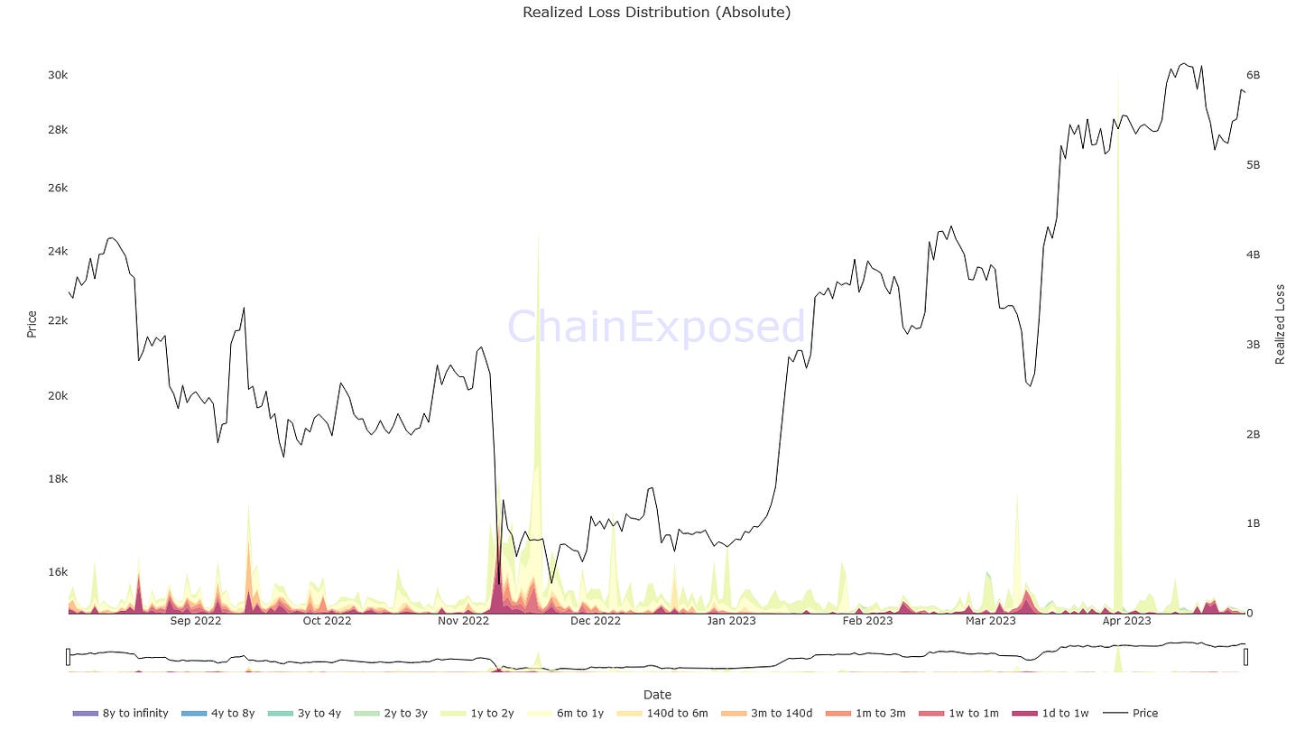
The realized loss distribution is an onchain metric that allows us to identify the basic onchain cost (the value of the asset) for each category of specified holders, in this case by age and amount of Bitcoins held, and therefore to distinguish the latest movements to understand which of these moved their Bitcoins while the market price was lower than when they had previously moved them.
Simply put, it's about figuring out who made losses onchain.
Above we have the realized loss regarding the age of detention.
In this case we can see for ourselves that the extent of the losses realized is now truly irrelevant and that the peaks are single and highly random, therefore relegated to events that we have no reason to worry about.
Usually, you buy for the short term when losses are high and constant and through a confluence of various onchain metrics and indicators and supports in technical analysis you realize it's time to get in.
For these notions, Chainlog.info has courses for you, but there are many others and all the knowledge you learn will work in your favor in the long term. Don't make the mistake of underestimating knowledge compounding.
Above we have the realized loss regarding the amount of coins held.
There's little to say about this graph that we haven't already said. Single random events of realized loss, deriving from humpbacks (10k+ coins).
Here we confirm that the market is now being manipulated by these big fish, watch your trades.
Long Term Holder Realized Loss (% of LTH MCap)
Long Term Holder Realized Loss (% of LTH MCap) is an onchain metric that helps us understand historical moments when LTH realized the most losses.
These percentages concern the LTH market cap and not the overall market cap.
As you can see, every time a bear market hits the markets, 6 to 12% of Long Term Holders lose faith in the system and retreat, making large losses on chain.
In any case, among these, there are also new entries who, by buying near the maximum or high price levels, having convinced themselves of the quality of the asset, move their coins while the price is at the lowest point, so as to keep them safe , but thus realizing a very high onchain loss.
However, what interests us in our case is what we can see by putting these data together, namely that when the realized loss percentage falls below 1%, what tends to follow in the following months is a bull market, except for black swans such as that of COVID.
What's also interesting is that the peaks are found right in the depths of bear markets, giving us other indications of when and how a bear market ended, whether to invest in the long term or whether to wait for a more opportune moment.
Whale SOPR
Whale SOPR is an onchain metric that allows us to identify the profitability periods of whales.
When it is above 1 the whales are in a state of unrealized profit, while below it, they are in a state of loss.
This graph therefore answers the question: If whales were to sell now, would they be in profit or in loss?
Now, what we are interested in knowing is the conformation of the graph through atapoint ids that lead to known patterns.
Simply put, the movement of the red line against the market price of Bitcoin.
Here we can see how the Whale SOPR goes below 1 in bear market periods, and tends to rise above 1 just before a bull market, using 1 as support multiple times as prices rise.
Today we find ourselves in exactly the same situation, with the consequent possibility of finding ourselves at the beginning of a new bull market.
As always one should use these metrics with confluence from other onchain metrics and technical analysis to be sure, and analysts like me always do this to make sure they minimize the possibility of errors resulting from sharp focus.
If you want to know more about the previous metrics, I talked about them, in English, in my last Youtube live:
Here ends my analysis, but we will meet again soon.
As always, greetings to all and much prosperity!
(All opinions expressed above are the author's personal opinions and should not form a basis for making any investment decisions, nor should they be construed as a recommendation or advice for engaging in any investment transaction.)


